Blog

  • How does UX design relate to furniture design?

    How does UX design relate to furniture design?

    For over 20 years, I have been working across multiple design disciplines. The roles of such have changed with trends but the principles of good design remain the same. The ten principles of good design by Dieter Rams who influenced Jony Ive at Apple for decades, are as true today as ever. I started my design career as an interactive or multimedia designer and now, I work across brand and digital design experiences. I say experience, as every form of brand led communications or interaction with products including the physical, will be impacted by how we perceive it. When we touch or engage, our rational thinking is complimented by emotionally driven ideas and responses. We think ‘this chair feels comfortable, I’m relaxed sitting in it’ or ‘this screen has clear interactions for me, I feel comfortable to use it.’

    Starting a modern furniture brand with no prior experience of industrial design had some challenges, however, the considerations for making a piece of furniture, a website or a digital application are all grounded in design thinking. This unites all forms of design disciplines. 

    Design thinking is a way of problem-solving, by putting the needs of the user first. Any human interaction or experience should be created by adopting a design thinking mindset and following a process of steps:

    Empathy – think from the perspective of your user and their needs

    Definition – define the problem you need to solve

    Ideation – brainstorm ideas by create mood boards, sketching or drawing

    Prototype – build clear and thoughtful representations of draft solutions

    Test – assume nothing by testing with real users to gather important insights

    Implement or build – develop your design ideas further and build the final product


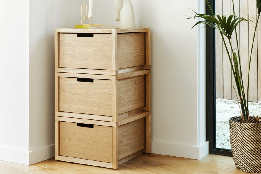
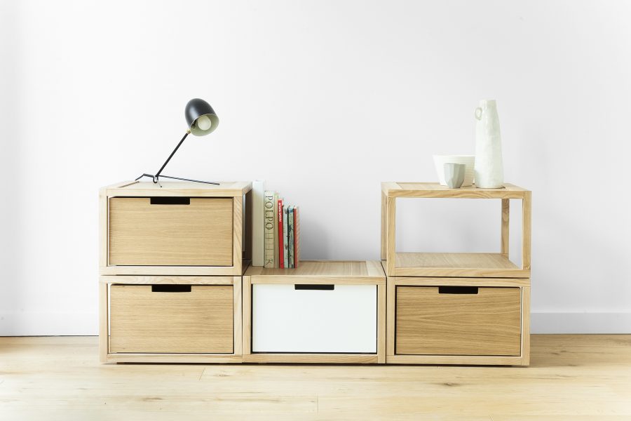
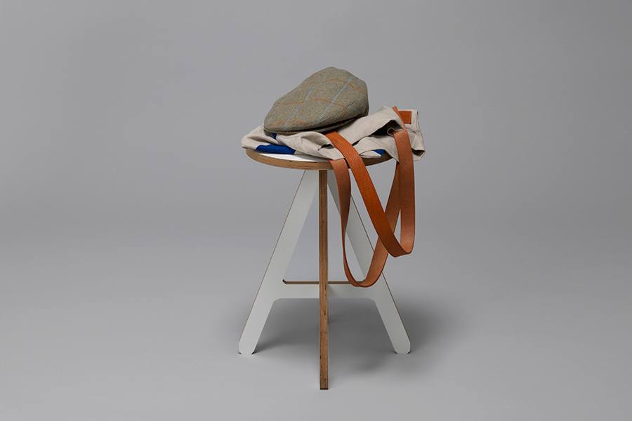
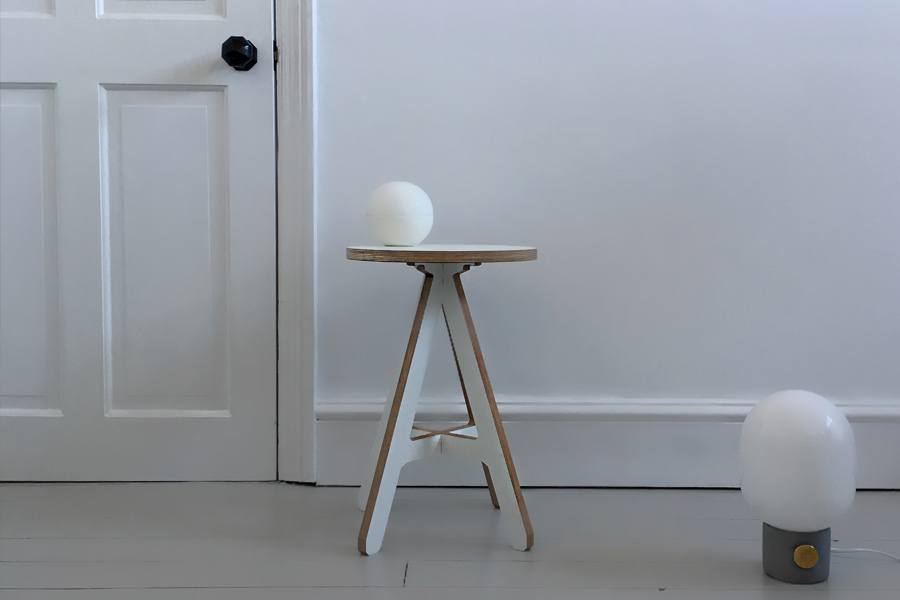
    In the fields of industrial, interior and furniture design, you will often hear designers referring to the ergonomics of a product. This is can be defined as ‘The practice of relating to or designed for efficiency and comfort in the working environment.’ In other words, the ergonomics of a product are linked to the needs of the person. When I designed the A Stool, I had a genuine need – I lived in a small flat in London and needed a flexible furniture. Modern furniture which could adapt to my daily needs: sitting, eating and supporting. It follows therefore, that furniture design and digital design (UX Design) are deeply connected, in that they are driven by design thinking.

    If we look back at early civilisations like ancient Greece or the Egyptians, many of the first ‘tools’ were conceived to aid or enable mankind to make things in order for society to thrive. Historians believe the first type of furniture made was probably a stool due to its simple construction, combining a seat with four turned legs. Chairs evolved later and are much harder to design because of their amplified ergonomics – a stool requires ‘man’ to sit up straight whereas a chair offers a seat and also supports the back. Is it not absurd to suggest the principles of digital or UX design can therefore be traced back to ancient times and the design of furniture and tools. These forms of design are human-oriented because the design is established to solve a need. The functionality of product designs within the digital world, are often clearer in terms of their objective and link to identified user needs, however the experience can be very frustrating due to the poor design. Take the Google Calendar as an example. The buttons are clearly labeled but the interaction doesn’t always provide the expected screen or use the simplest steps to perform a task. On mobile, to add a new event on a specific date, rather than being able to select a date from the month view and adding a specific event, you have to click an ambiguous ‘+’ button. The user can enter a title, then select the date. This process is fine however, the steps are different to that on desktop. Users are constantly switching between desktop and mobile, and we all learn functional processes through interacting. But if the processes are vastly different between devices, frustrations can rise as the human brain has too conflicting ways to solve the problem. I read blog articles from users who were frustrated with the calendar and it was suggested by one publisher, that because there are so many users interacting with the software on a regular basis, Google are resistant to make changes. The disruption of change could lead to more complaints in the short-term but what about the design thinking in the first place?

    Let us not forgot the role of aesthetics in design. Successful product design can’t be granted due to the functionality alone. Modernism was a design movement started in the 1920s, driven in part by the devastation caused from the first world war and the Russian revolution. Both events impacted on the availability and supply of materials, but also lead to a desire to reignite and design a new kind of society. The new world would take aesthetic cues from technology, manufacturing and human-centred needs. 

    The often minimal aesthetic seen from objects of era, have led to a timeliness quality which should be applauded – especially in an overly populated world with a disposable approach to consumer products. However, the artistic merits of a design mustn’t be compromised by the function of a product. Digital experiences, objects and furniture all need to be beautiful and I believe, this can be achieved by giving them a personality. Lavish adornments dominated design from the Victorian and Art Deco periods, which do offer visual personality but they aren’t grounded by the desire to express meaning. The Modernist movement questioned why decoration of any sort was needed, which led to the stripped back aesthetic. This remains the dominant approach in many design disciplines, but especially toward modern architecture. 

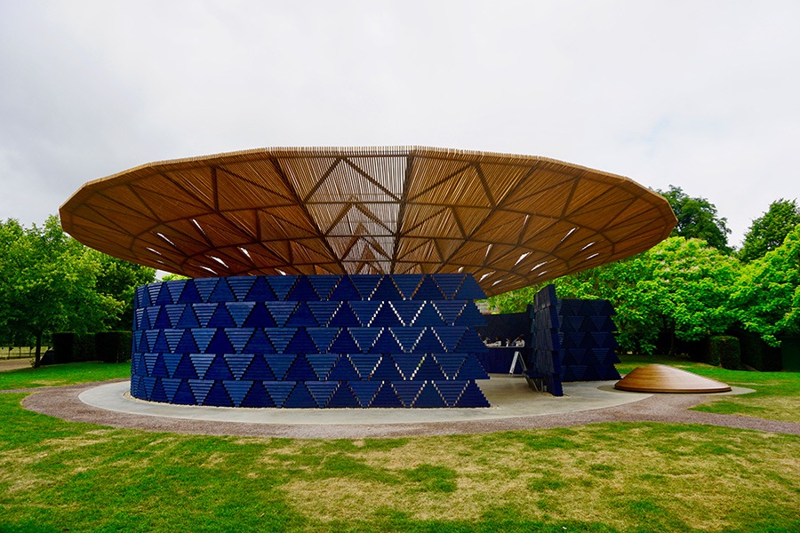
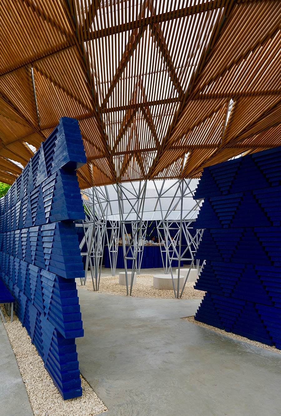
    I recently watched a TED talk by architect Thomas Heatherwick, who says ‘Where did all the lumps and bumps on buildings go? When did city architecture become so … dull’. He is referring to the ubiquitous approach to designing soulless buildings of steel and glass that dominate our cities. Where local cultures and traditions from one continent to the next, are smothered by bland, international design approaches. He makes the case for ‘radically human buildings’ and I urge you to watch the Thomas Heatherwick presentation. Instead of adorning design as a decoratative layer, Heatherwick brings artistic direction through the entire concept of the project. The cancer treatment development at a leading hospital in Yorkshire, which his studio was commissioned to design, was built on the last patch of greenery on the site. Heatherwick choose to retain this green space by creating giant plywood structures, which slotted together and raised the building above the land. The outcome was a space for patients, staff and visitors to come together, a human-centred approach. Aesthetics and functionality are equally important components to design.

    UX design has become a popular disciple as more experiences are offered to users digitally. The features and tools would be uninteresting to use if they were offered to the user on a plate of corporate blandness. Enter the role and importance of visually identity. Every brand of scale needs to leverage their foundational, stylistic elements, or ingredients – I like the metaphor of visual identities being like a recipe in the kitchen; add the correct amount of each ingredient at the preferred stage and you’ll cook up a treat but when we cut corners or add too much of something and the dish will leave a bad taste in the mouth. Poorly implemented identities in digital applications will either look inconsistent from the core brand or simply be confusing, even impossible to use – think about UI colour ratios for accessibility. The identity makes an experience feel connected to the brand, which in turn, should portray the idea behind the brand – its reason for being in response to a human need.

    Good design in today’s world has to be aesthetically interesting (artistic), have a purpose (human-centred design) and a clear personality (brand led) in all forms of practice. This post isn’t a historical journey charting the principles of design, it simply suggests that all design is connected through shared methodologies. Rest in peace Dieter Rams, who sadly passed last month and whose methodology lives on.

    Good design:

    • Is innovative
    • Makes a product useful
    • Is aesthetic
    • Makes a product understandable
    • Is unobtrusive
    • Is honest
    • Is long-lasting
    • Is thorough down to the last detail
    • Is environmentally friendly
    • Involves as little design as possible
  • The Best Pre-Fabricated Homes and Their Benefits

    The Best Pre-Fabricated Homes and Their Benefits

    The pre-fabricated homes have caused a revolution in the modern architecture market. The current housing crisis means we need to rethink the approach to architecture and housing. KODA and HebHomes are radicalising the design world, by taking inspiration from Jean Prouvé.

    Just like ByALEX furniture, the pre-fabricated homes can be relocated, used for multiple purposes and even piled up on top of each other to create a complex cluster. Space saving is the name of the game. Read about how these revolutionary trends are shaping the way we live.

    KODA home

    The Estonian firm Kodasema developed KODA, the first house which can be built in a day and transported on the back of a lorry. They offer a £150k package which covers the planning and building regulations, delivery costs, site preparation, and installation. It is a flexible, adaptable and eco-friendly house which offers many possibilities from an office space to retail and living. Built using low-carbon materials, the sustainable houses are well insulated. The concrete walls control the temperature and noise levels to keep the occupant comfortable and at ease. All you need set up your own demountable house is a small plot of land with access to water, sewerage, and electricity. And because they come all-in-one, you can start your minimalist life in a blink of an eye.

    Maison Aluminium Métropole

    Architecture like this has learnt a lot from pioneers like Jean Prouvé, the farther of prefabrication. In 1949, his project Maison Aluminium Métropole won the government-run competition to provide a solution to the housing and teaching crisis in rural areas of France. 15 of the Prouvé’s completed designs managed to set the new trend in modern architecture. As a result, the pre-fabricated homes have been becoming an increasingly popular alternative in the property market ever since. The structures are easy to build and relocate, and as such they represent a minimalist living solution accessible worldwide.

    HebHomes is a Scottish company providing energy efficient kit houses to create homes tailored to any needs. As such, it contributes to improving the quality of living in Scotland and enables people to design their dream home. Thanks to the testing against Hurricanes, the business is both, a commercial and a social one. In other words, HebHomes are a great solution for customers in crisis, be it a natural disaster or a housing shortage.

    KODA and HebHomes are providing affordable solutions to various problems in multiple environments – from stores to bedrooms. Both brands are great examples of a flexible architecture which is well made, modern and effortlessly functional. By effectively tackling one of the current social issues it embodies the definition of a good design. It answers a need with a genuine story, considerate to materials and with a timeless aesthetic.

    HebHomes Airigh

    Neither brand wastes energy nor resources on creating overly decorated objects with unclear purpose. Instead, the brands stand by purity in creating solutions which are clear, understandable and affective. When creating a minimalist space, think twice about what furniture and decoration to choose. As a strong supporter of minimalism, ByALEX creates multi-purpose, flexible and versatile pieces with the power to elevate your home from bulky spacious home.

    Overall, to transform your house or apartment, you should take one step at a time. Maybe you start with a piece of furniture before exploring in more detail the benefits of pre-fabricated homes. Remember, becoming a minimalist is not an easy task and consistency is key. So, are you ready to make a change?

    HebHomes UK


  • Ten Principles of Good Design: Functional Beauty

    Ten Principles of Good Design: Functional Beauty

    We all have different figures of inspiration in our lives that mould and influence our work. Dieter Rams has been one
 of the main sources of inspiration for Alex Swain. As for Rams, he found his inspiration in the unwavering values of Japanese aesthetics; purity in thought that translated into simplicity in product.

    Simplicity should not be simple for the sake of simplicity. It would then become decoration, which is ‘worthy of guilt’ according to Yanagi (1973). Rams defines simplicity as ‘the essential relationship between the given function and the form which is reduced to the minimal.’ In other words, the closer the relations between a product and its user, the more beautiful it’s simplicity is.

    Dieter Rams Ten Principles of Good Design
    Tabletop Radio

    Dieter Rams Vitsoe shelf
    Shelving System by Dieter Rams for Vitsoe

    We should not view function as the bane of beauty. Rams crafted his ethos with a perfect blend of both. This is where he began to deviate from the Japanese way of thinking. Instead of using the beauty in nature as a starting point, Rams begins with thought. He believes that functional simplicity is only possible with intellectual research. With a depth in understanding, conscious awareness and a strong ethos, designers can greatly influence the nature of our product world.

    Rams crafted the ten principles for good design which have inspired the work of many design studios, ByALEX included.

    1. Good design is innovative
    2. Good design makes a product useful
    3. Good design is aesthetic
    4. Good design makes a product understandable
    5. Good design is unobtrusive
    6. Good design is honest
    7. Good design is long-lasting
    8. Good design is thorough down to the last detail
    9. Good design is environmentally friendly
    10. Good design is as little design as possible

    By following these ten principles of good Design, ByALEX contributes with the creation of beautiful furniture where space saving is not a burden, but a virtue (discover more contemporary home ideas here).

    Dieter Rams Ten Principles of Good Design
    Dieter Rams Chair

    Intellectualism can however seem to be a foe of simplicity. But Rams resolved this by a conscious intention to be simple-hearted (pure), but not simple-minded (ignorance). Simplicity out of ignorance evolves into an excuse to hide behind superficiality, further attributing to today’s visual pollution and chaos. On the other hand, simplicity birthed out of knowledge will result in optimal functionality and the best possible user-quality that will facilitate long-term and economical use.

    What made Rams truly remarkable, is the ability to condense the sophistication of human needs to minimal design . He mainly achieved this through a tedious process of reductionism with an emphasis on quality and details. After stripping the extravagance away, all that remains should be simply beautiful, truthfully justifiable and easily understood. At the end of the day, less is only more if it is also better.

    Summarised in a few words, simplicity is achievable through consistency and effort. In the world which continues to pile up with ill-conceived products, purity is gaining an increasing importance. The ethos of Rams will continue to remain as our frame of reference here in ByALEX.

    Think harder before you design, make and sell… try following the ten principles of good design.

    stackable Wooden storage boxes
    ByALEX Playwell Wood Storage

    References:

    Awwwards ‘Less, But Better: Dieter Rams’s Influence on Today’s UI Design’, AWWWARDS. Available at: https://www. awwwards.com/less-but- better-dieter-rams-s-influ- ence-on-today-s-ui-de- sign.html 2017].

    Burton, S. D. (2014) ‘Minimalist, functionalist: The influential designs
of Dieter Rams’, Classic Driver. Available at: https:// www.classicdriver.com/ en/article/design-furniture/ minimalist-functionalist-in- fluential-designs-diet- er-rams (Accessed 6 June 2017].

    Frearson, A. (2017) ‘Sim- plicity is the Key to Excel- lence’, Dezeen in Interview with Dieter Rams [Online]. Available at: https://www. dezeen.com/2017/02/24/ dieter-rams-designer-inter- view-simplicity-key-excel- lence/ 2017].

    Klemp, K. (2010) Less and More. The Design Ethos
of Dieter Rams London: Gestalten.

    Lovell, S. (2011) Dieter Rams: As Little Design As Possible. London: Phaidon.

  • Serpentine Pavilion Designed by Diébédo Francis Kéré

    Serpentine Pavilion Designed by Diébédo Francis Kéré

    The 2017 Serpentine Pavilion is traditionally located in the heart of Hyde Park, and designed by the award-winning architect Diébédo Francis Kéré, it is the most spectacular one yet. It combines the beauty, the purity and the effectiveness every good design should have. Let me introduce to you to the ‘Tree of Life’.

    In the 17 years of the Serpentine Pavilion’s history, there have been many interesting architectural constructions. It is safe to say that majority of these projects have been life-changing and remembered long after they have been taken down. The 2017 has been marked by many political, economic, and environmental issues. Inspired by his roots, D. F. Kéré decided to design a structure that focuses strongly on the community and promotes gathering whilst respecting the environment and providing a shelter in the unpredictable British weather. During rain, it creates a fascinating waterfall in the centre of the structure and collects the water to be then used in the Kensington Gardens.

    The unique colour choice (also protecting the wood) has been inspired be the architect’s country of origin, Burkina Faso, where indigo blue represents strength and confidence. The inside structure is made from steel to add longevity. The Pavilion is also magically lit at night, to attract the passers-by through showing a welcoming light.

    This year Serpentine transforms into a cultural melting pot, through bringing together places where the architect was born, where his practice is based, and where the design is currently located – Gando, Berlin and London, respectively. The pavilion embodies the development process which is a crucial part of creating any architecture project. The decisions behind why a building looks as such is also the subject of this year’s Chicago Architecture Biennial which uncovers the history and strives to make a new one… more on this soon!

  • Best Advice for Space Saving in Your Home

    Best Advice for Space Saving in Your Home

    When life runs at the speed of a rollercoaster and you are feeling the stress of increasingly expensive property prices, learning the best advice for space saving in your home is important. Especially when living in an inner city apartment, learning how to maximise space and utilise every millimetre of your home.

    The solution to the reappearing problem of saving space in your home – buy more versatile furniture designs. Think about your apartment as a wardrobe. Every fashionista knows that when you have nothing to wear, a cotton t-shirt paired with well-fitted jeans does the trick. The same goes for furniture – it must be simple, functional, and timeless. To create your unique aesthetics, you need a basis of timelessly elegant pieces which you can mix and match indefinitely.

    Alex Swain’s A Stool for example passes the versatility test! An adaptable piece of modern furniture which you can use as a bedside table, an additional seating, a plant stand, a foot stool or countless other options – these ideas all lead to space saving throughout your home. All you need is your imagination. Like the cotton top, you can pair it with multiple items and, although you can live without it, your closet will never feel complete until you own one.

    Small spaces have the advantage of constantly reminding you to ‘stop buying, start utilising’. Therefore, think about all the objects you already own and which one of them you really need. What makes you happy and what classifies as an impulse purchase? Space saving your home means picking your favourite pieces and picture them in different areas – the living space, the bedroom and the kitchen corner. Can you think of at least three different uses for your chosen furniture piece? If yes then keep it.

    Living in small apartments is fun because you are living in city, surrounded by inspirational culture and things happening all the time, but it comes at a price. Approach it as an ongoing challenge of space saving and celebrate your achievements along the way. Utilising what you have and letting go of what you do not need will not only free your space but also free your mind!

    space saving in your home

  • Jon Walker x ByALEX: Recycle Bin Design Collaboration

    Jon Walker x ByALEX: Recycle Bin Design Collaboration

    Maybe you’d like to recycle more? Maybe you’d like the piles of paper, plastic and glass to be out of sight? Maybe you’d like your bin to look as good as the rest of your kitchen?

    We are excited to announce a new collaboration with Jon Walker who has created the dwiss: a wood recycle bin. Made of Beech plywood, the dwiss unit will be part of the ByALEX collection and available to buy from our website soon.

    Jon shares our values of clean, minimal product design made from sustainable materials – it’s all about pure, high quality ingredients. The dwiss wood recycle bin has been developed for use in the home and office. The multiple compartments allow you to store your general waste and all your recycling. #ReclaimYourWorktops – we couldn’t agree more!

    More details coming soon, very exciting!  Sign up to our newsletter to stay up to date with developments.

    Shop now

    wood recycle bin Byalex

    wood recycle bin Byalex


  • Family Holiday in Copenhagen and Devon

    Family Holiday in Copenhagen and Devon

    Family holiday in Copenhagen


    https://vimeo.com/230627978

    August, the month of holidays for Europeans all over. So what about a family holiday in Copenhagen and Lyme Regis? This year we booked two contrasting trips: a weekend staying with friends in Denmark and a week in Devon on a farm. This is my guide to enjoying a family holiday in Copenhagen or Lyme Regis.

    Copenhagen is a modern city with a rich design history and Devon is an agriculturally rich, sleepy county with rolling landscapes and a striking Jurassic coast line. Despite their contrast the most enjoyable times on holiday can be described in similar ways. The moments when your not connected to the internet – physically (no wifi) or emotionally (not checking your feeds) when instead, you are immersed in your surroundings doing very simple things with lovely people. 

    Family holiday in CopenhagenFamily holiday in Copenhagen

    GUBI store

    family holiday copenhagen

    Normann Copenhagen store

    I adore visiting beautifully designed lifestyle stores displaying modern wood furniture and Parisian inspired lighting, but it was being outside; being active with friends and family that that was the most fun. 

    A family holiday in Copenhagen works so well because of it’s excellent public transport and is set to be the world’s first carbon-neutral city by 2025. Our friends use Christiana bikes to get around though and we spent two days cycling around the city in the rain and sunshine. Travelling anywhere with a toddler often means they need to be carried – little legs don’t have much stamina! So the bike with a cabin mounted at the front is the best way for the whole family to see the city. We cycled through through the rain and sunshine, crossing canals and dodging pedestrians (I had some embarrassing turning moments!). Copenhagen is very safe and easy to navigate – perfect for any visiting family. There are so many design stores worth a visit but hanging out in cafes and choosing the best street food filled our days. We also saw inspiring architecture everywhere. Opposite the incredible Black Diamond (Denmark’s Royal Library), is a rotating bridge created by Danish / Icelandic artist Olafur Eliasson. The circular platforms turn around to let larger boats pass through; genius! 

    family holiday in CopenhagenOne stop you should definitely try is the understated La Banchina: a restaurant / bar on the pier at Refshalvoen, very close to the sea. Set in a quiet corner of the canal network, it serves simple bar snacks like crusty breads with olive oil and just one dish every day. We enjoyed a bottle of wine before the ride back home and my ‘not so little legs’ just about made it – boy I was stiff the next day. Copenhagen is a much easier place for a family holiday than busier cities like London, Paris and Barcelona. 

    Family holiday in Copenhagen
    Family holiday in Lyme Regis


    We flew back to the UK and drove down to Lyme Regis in Devon. Staying on a farm wasn’t quite the romantic experience I thought it would be; too many smells, sorry! The Jurassic coast line stole the show though; words and photos won’t help, you have to go there. The beach at Charmouth is stunning and great for fossil hunting. Shale rocks splinter the edge of the cliffs whilst Flint and Limestone boulders scatter the golden sands. As the sea retracts, a large flat expanse of soft wet sand is uncovered where we spent hours playing football with Beatrix. 

    family holiday devon
    Everyday on holiday with children are long, as they need so much entertaining. And all long days need to start with a good breakfast in my opinion. A close friend (thanks Kate!) gave us the ultimate tip off: Town Mill Bakery in Lyme Regis. The concept is simple, you help yourself to any food you’d like and then cook it. This includes boiling your own eggs (timers and a pencil for marking your egg are provided) and toasting freshly baked sour bread. The food displays were simple but looked great by the use of natural materials, including plywood wall mounted boxes. Town Mill Bakery offers a relaxed and friendly atmosphere that is very family friendly… not sure this concept work in London hey, hmmm?!

    town mill bakery lyme registown mill bakery lyme regis town mill bakery lyme registown mill bakery lyme regis

    Town Mill Bakery

    devon family holiday

    Lyme Regis 

    Our final day on holiday was spent at the River Cottage, a farm and now venue for weddings established by chef Hugh Fern Whittingstall. The farmhouse and outbuildings have been converted, allowing the team to serve incredible food to large groups. All locally grown and sourced (of course), the menu was truly out of the ordinary with intense and complex flavours. We played games in the garden like tossing wellington boots and giant skittles, whilst drinking aromatic Gin & tonics.

    The best family holidays are fun and simple, with no real plans. We choose Devon and Denmark. We got out on the bikes, explored beaches and enjoyed simple food; a perfect family holiday in Copenhagen and Lyme Regis.

  • Natural Materials by Jord Home x ByALEX

    Natural Materials by Jord Home x ByALEX

    There must be Viking blood running through my veins as my design aesthetics favour the Scandinavian approach. So I was delighted when Jord Home, a Nordic textiles brand contacted me asking if we could collaborate. Sharing an passion for natural materials and a sense of well being through relaxed interiors, we sent up some of our furniture for use in a new photoshoot. Jord Home sources beautiful rugs crafted on traditional wooden looms using cotton, jute and wool, together with Reindeer and Cow hides, which come from Sami people; a nomadic tribe who travel across Sweden, Norway and Finland. The collection is hand picked and they offer a bespoke sourcing service if client’s require specific hide tones.

    Sound special enough?

    The benefits of decorating your home with natural materials are positive, but with so many products available to us all, it is easy to forget the reasons and we sometimes opt for synthetic and less sustainable designs. Products made in natural materials bring honest textures into the home, which we subconsciously identify with – before the industrial revolution, our ancestors had to source materials from the land. Natural materials last longer and age with beauty, soft patinas build up on leather and wood bares the marks of daily use. Their inherent character matures over time and objects can feel part of our family; a wooden kitchen that hosts meals, a rug in our children’s room to play on. Adopting natural tones and colours in our homes give a peaceful, effortless interior style. The Scandinavian countries have kept a strong connection with the outdoors and nature, I believe this can make us all feel happier and healthier. What do you think?

    Shop the Ford Home collection here.

    natural materials

    Beni Ourian rug woven in pure wool by Jord Home £350.00

  • The Summer of Plywood – the Best Furniture Designs

    The Summer of Plywood – the Best Furniture Designs

    Why Plywood is Great for Furniture Design
    1967 was the summer of love, when 100,000 people living in San Francisco converged in the Haight-Ashbury neighbourhood. Hippies, families and groups from all walks of life campaigned for a better world. They rejected consumerist values, opposed the Vietnam War, and celebrated the arts and meditative practices.

    So 60 years on, what would the hippies think of 2017 being the summer of plywood? The V&A show: Plywood Materials of the Modern World opened earlier this month, which features product and furniture designs from the internationally famous designers Alvar Aalto, Marcel Breuer and Charles and Ray Eames. Plywood is an honest material which has been popular with architects since the 1950s but it has had a mixed appeal from the general public. In the spirit of starting a revolution, I protest!

    In 2010 I lived in a small London flat and couldn’t afford expensive furniture. My only option was IKEA but I really didn’t like the idea of buying furniture made from chipboard wrapped in a plastic coating. It felt wrong to me as I believe in quality materials as you tend to respect the product and therefore keep it for longer – sustainability is as much about buying less as it is about buying better.

    Then I re discovered plywood and imagined how it could be used to create furniture designs. I thought ‘this is great material, it’s honest, flexible and incredibly strong’. Plywood is made from the fast growing Birch spices by peeling the trunk into veneers and bonding multiple layers to form a panel. Plywood designs can also be inexpensive compared to furniture made using Oak or Ash – even if you make glu-board solid panels. I love Oak and Ash furniture but with global populations increasing the demand on these timbers isn’t manageable. Most Oak / Ash furniture sold is a mix of veneered MDF with some solid timber for legs or beams. Plywood is plywood, you are buying real wood throughout. Plywood furniture design is more genuine than most other wood based pieces available on the market.

    plywood furniture design ByALEX
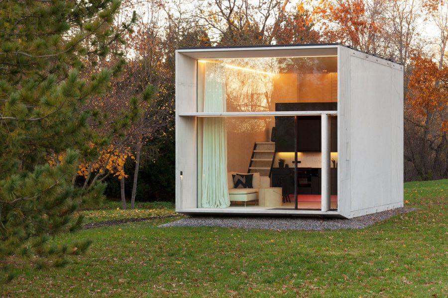
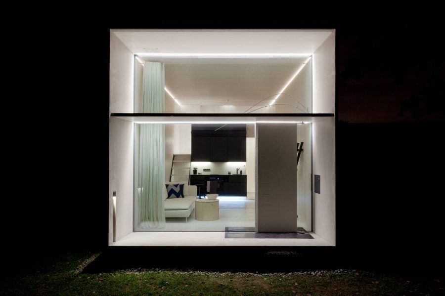
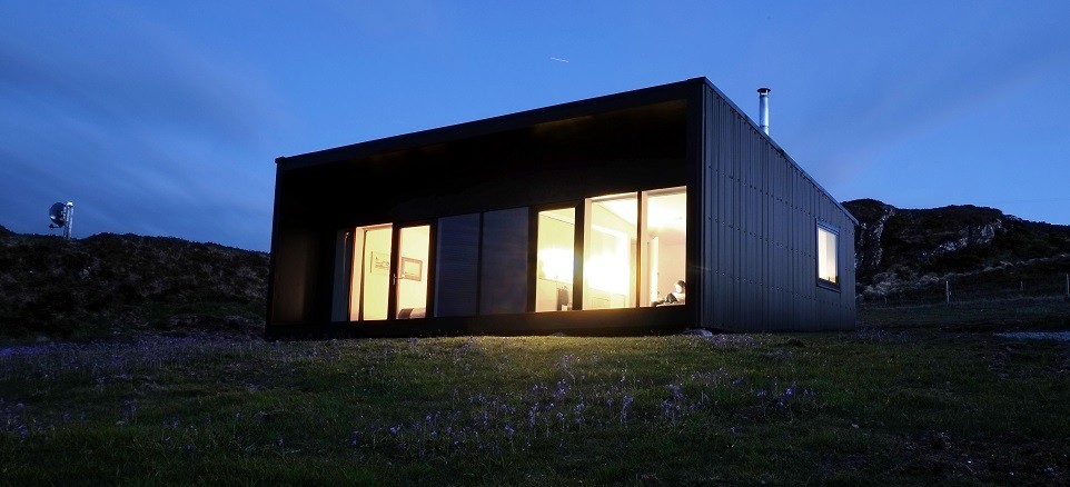
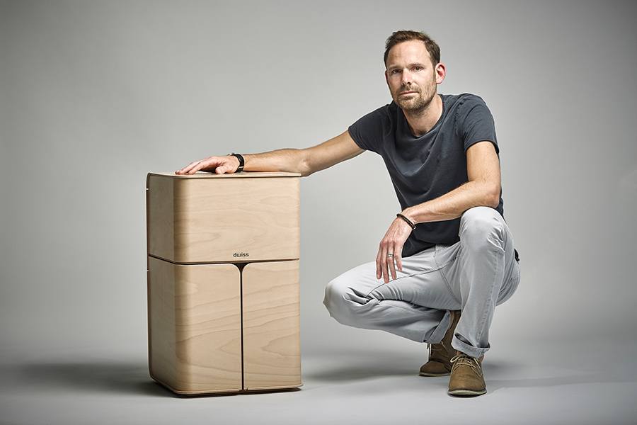
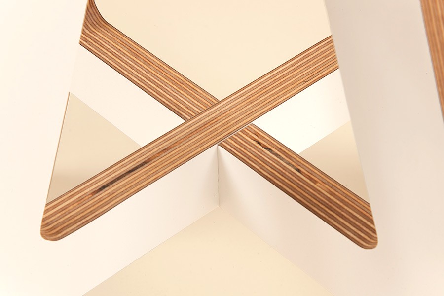
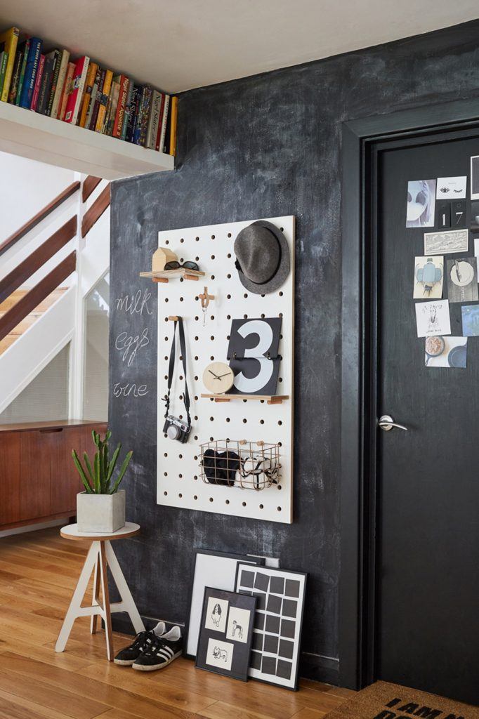
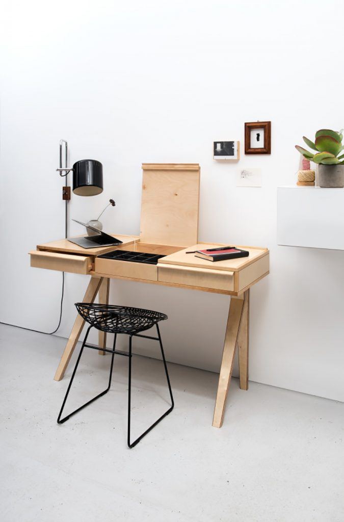
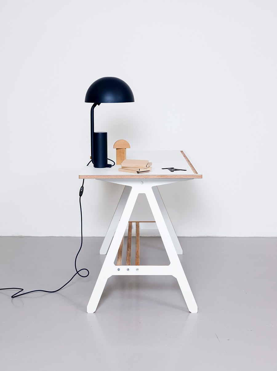
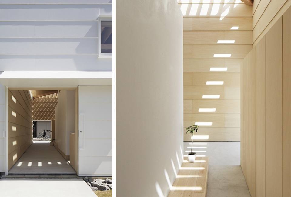
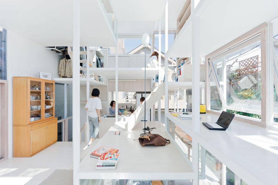
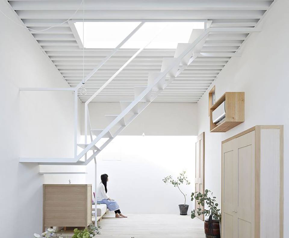
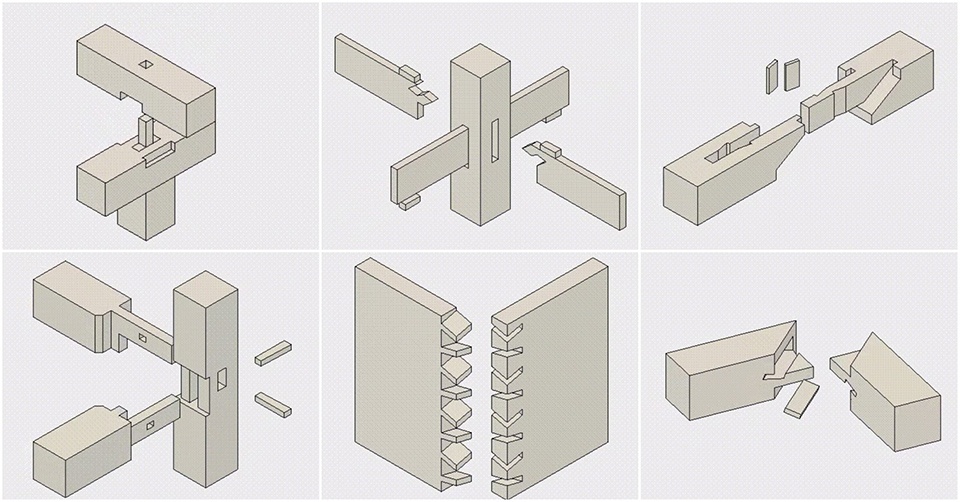
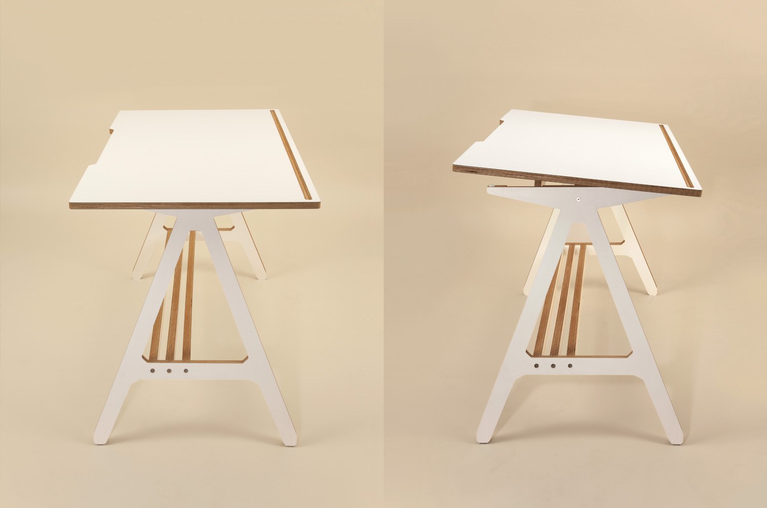
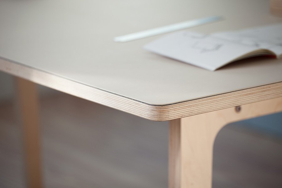
Plywood is the material of the future. Plywood can be used to create beautiful furniture designs, cabinets, kitchens and even complete houses… it is time to change our preconceptions and enjoy this natural, wooden material with the benefit of a more sustainable life. Below I have included some of my favourite plywood furniture designs.

    Peace to plywood!

    line

    plywood furniture design nikki kreisPeg-it-all: Pegboard designed by Nikki Kreis
    line

    plywood furniture design pastoeEB01 desk designed by Cees Braakman for Pastoe
    line

    plywood furniture design barber osgerbyCoffee Table designed by Barber Osgerby for Isokon Plusline

    plywood furniture design byalexA Desk designed by Alex Swain (me)

  • Japanese Interior Design – The Key Features

    Japanese Interior Design – The Key Features

    Japanese interior design and their homes is seen as one of the greatest embodiment of minimalism in the world today. Apart from its impeccable beauty, their interior design is also known for its masterful combination of simplicity, precision, and sophistication. Their form of aesthetics is deeply rooted in spirituality (Buddhism) and philosophy and they strongly believe in the integration of nature and the importance of home. According to their beliefs, the world of beauty starts in the home; and therefore to long for beauty is to long for home. The Japanese are devoted to creating homes with interior design that radiate natural beauty – a relaxed, simple approach to design that offers calm and peace from the hectic world outside. Here are some of the key characteristics of modern Japanese interior design for the home.

    line

    1. Lightweight

    ‘Lightness’ in this context can be taken both literally and figuratively. It’s literal meaning connotes ‘weightlessness’ as a result of construction with minimum materials, and its figurative aspect connotes emotional lightheartedness in the perception of the product. This characteristic is heavily associated with the nation’s emotions and scarcity of natural resource, especially after World War II.

    Japanese Interior Design

    House in Yamasaki, interior design by Tato Architectsline

    2. Declutter

    Japan is also widely known for minimalism as a lifestyle through a practice of ‘decluttering’. Marie Kondo, author of ‘Spark Joy’ set off a decluttering craze around the globe by encouraging us to only keep things that ‘sparks joy’ in our hearts. She caused many to reconsider what truly matters, and brought them to the realisation that fewer possessions lead to greater empowerment and a healthier lifestyle.

    Japanese Interior Design

    Muji Houseline

    3. Natural Materials

    Yanagi Sōetsu, a well renowned Japanese philosopher and craftsman, explains that the ultimate beauty is found in nature. This is often known as ‘mono no aware’, which can be translated as “awareness of the transient beauty of nature.” Japanese interior design often consists of furniture made from natural materials, especially wood used in a modern way. They believe that materials have a soul, and they ‘amaze and delight’ if you know how to study them, question them, and listen to them. You will find the use of natural materials throughout a Japanese home, from framing architectural features like windows and openings (see below), to room divides, staircases and the actual building construction. The sustainable benefits of constructing with natural materials are also important to note – Japan has to import many of it’s raw materials and has little land available for disposal of waste, so their relationship to biodegradable materials is evident.

    Designed by Tato Architectsline

    4. Illumination

    Illumination is the art of light within interior design. Light is one of the most important characteristics in Japanese aesthetics. Though it cannot be held, it is a ‘material’ that can be seen and felt. The visual drama conveyed by daylight causes spaces to evolve into living organisms that impact our emotions. The Japanese house is usually designed and constructed around the motion of natural light and its relationship with natural materials used in the interiors. Let’s face it, natural light in our homes makes us all feel happier and healthier because we feel more connected to the outside world.

    Japanese Interior Design

    Light Walls House by Atsushi Kawamotoline

    5. Modular Design

    Land is a premium in Japan, especially in their main cities. This left urban dwellers with extremely tiny homes, but also inspired architects and designers to become more intelligent with spaces. Modular homes and living is therefore very common in Japan. A home can be divided into smaller living spaces that are multifunctional and multifaceted, through clever interior design schemes (as seen below). A dining area can transform into workspace or a library within minutes, allowing compact spaces to be spacious and dynamic.

    Japanese Interior Design

    NA House by Sou Fujimot

    line

    6. Void

    Void is another key intangible material within Japanese interior design. Unlike the western notion of void as ‘nothingness’, the Japanese understands void as ‘emptiness’; a vessel waiting to be filled, or a blank page awaiting the artist’s brush. Alternatively, think about the way composers have described music: ‘The music is not in the notes, but in the silence between them.’ According to Kenya Hara, Muji’s creative director, emptiness provides a space within which our imaginations can run free, vastly enriching our powers of perception and our mutual comprehension of things. The clear space links and visually balances the physical objects we fill our homes with.

    Japanese Interior Design

    Designed by Tato Architectsline

    7. Detail

    The crux of minimalism lies in the detail. There is an utmost richness is what is extremely plain and true simplicity is actually highly sophisticated. A good craftsman is one who pays attention to the details and makes them invisible. It is easy to make something seen, but great skill is required to make one unseen. An example would be the intricacy of Japanese wood joinery; the lengths taken to make two entities seem like one. The Japanese perceive true simplicity as a form of luxury. Modern wood furniture can appear simple in construction yet the engineering inside is deeply considered.

    Japanese Interior Design

    Japanese Wood Joinery line

    8. White

    Our world is a feast of every imaginable colour. Interior designs with myriad colour schemes are a populist approach. Within this vibrant spectrum, white is the most delicate and fragile. The Japanese see white as a signifier to purity and emptiness – it is used in abundance within Japanese homes. White has a texture that also evokes the materiality of objects and acts as a sign pointing towards its origins in form. The reduced use of bright colours is not seen as something missing, but as concentration to something even greater.

    ‘White can be attained by blending all the colors of the spectrum together, or through the substraction of ink and all other pigments. In short, it is “all colours” and “no colour” at the same time’. Kenya Hara

    Japanese Interior DesignHouse in Takamatsu by Yasunari Tsukada

  • Competition: Win an A Stool + SPOT Cards

    Competition: Win an A Stool + SPOT Cards

    This month we are happy to be collaborating with our friends at Grafik to offer readers a chance to win a White A Stool and SPOT Cards.

    The SPOT Cards were created to give you the freedom to create your own card design by pushing out dots on a grid. To Enter the competition, we are asking you to send in your best card design – the winner will receive an A Stool + 5x SPOT Cards and there will be two runners up who each get 5x SPOT Cards each.

    To enter the competition simply follow ByALEX on Instagram, then download the grid as a PDF and email your designs to giveaway@grafik.net and don’t forget to include “SPOT card” in the subject box

    Competition closes on Wednesday 27th April. All types of designs are welcome – patterns, words, letters or funny icons!

    Good Luck!

  • Make Your Own Card with SPOT

    Make Your Own Card with SPOT

    Introducing the SPOT range, a series of graphic led greetings cards, where a minimal aesthetic meets a playful concept, with the user determining the end design.

    When looking for graphic cards to send family and friends, I discovered that not many allowed me to utilise my own design skills or create something bespoke. Continually driven by the desire to offer simple yet innovative design solutions for contemporary urban life, I utilised my graphic design and typographical background to create the SPOT card – the beginnings of a new accessory venture and a perfect accompaniment to store in his home office furniture.

    Driven by an interest in grid formulas and inspired by Dutch graphic designers, such as Wim Crouwel, the SPOT card uses a grid of perforated dots that can be pushed out to create a bespoke design. The lines of dots can be removed with ease, allowing the user to either follow the suggested typographic designs or create their own imagery and patterns within the grid.

    The inspiration behind SPOT: silkscreen poster by MuirMcNeil

    “Designers enjoy using grids as it reduces the design options available and brings structure to the work. Take for example Paul McNeil and Hamish Muir who create parametric based designs within a geometric grid system – their work inspired my SPOT design.”

    Printed on Antalis Pop’Set paper and is available in two colour-ways, the design uses a secret formula to maintain the perforated spots. “The perforation wasn’t easy to make in production. We tried many paper thicknesses, hole sizes and techniques like laser and die cutting, before we found the solution – which is a secret combination.”

    SPOT Greetings Card

    £3.75
    [nm_button title=”Shop now” size=”md” link=”url:https%3A%2F%2Fbyalex.co.uk%2Fmodern-wood-products%2Fspot-greetings-card|title:SHOP%20NOW||” color=”#f50000″]
  • Better Ergonomics in the Workplace by Always Writing On A Slope

    Better Ergonomics in the Workplace by Always Writing On A Slope

    If you’re like me, working in a well designed environment is important to my overall mood and energy. I love being surrounded by plants and natural light, coupled with inspirational objects and artwork. My studio is like a cabinet of curiosity with material samples and design books lying around my desk, prompting me to develop new product ideas.

    Ergonomics in the workplace is increasingly more important. Most of us spend hours at our desks every week but are we all comfortable enough? Are we getting back pains from bad sitting habits – I definitely slouch into my chair after lunch and then straighten up by mid afternoon. Investing in a strong padded seat with lower back support is key, as is the idea of either standing up to work for an hour or using a tilting desktop. My father, an architect, worked for years at a drawing desk in his studio. The tilted angle positioned his work closer to the upper body – better ergonomics meant more comfort over long working hours.  

    The British designer Edward Johnston once said “Always write on a slope… never write on a flat table: it causes the writer to stoop.” Last year we celebrated 100 years of the London Underground typeface Johnston Sans, designed by Edward Johnston. You can see the original desk used by Edward Johnston, as shown above at the Ditchling Museum, Sussex. He is an inspiration to many graphic designers today and when I started to develop the A Range furniture, I adopted the sloping worktop idea to improve the ergonomics in the workplace. Even if you use a laptop all day, it’s easy for your posture to slump so I designed the A Desk to have 2-3 angled positions. The lowest being enough to push your shoulders out when typing on a laptop keyboard and the highest so you are closer to your drawing or writing. 

    A clear design idea like this leads to the need for functional elements like a pen tray. We use CNC machines to mill the A Desk and it was great to reveal the ply layers exposed within the pen tray. A simple solution to stop pens rolling off the desk. The white laminate protects the tilting desktop, which is easy to clean. So, look after your back, ensure your desk is comfortable to work from… now get back to work!

  • Top 5 Most Influential Dutch Graphic Designers

    Top 5 Most Influential Dutch Graphic Designers

    I have been interested in graphic design ever since my childhood. I grew up in the 1980s with big hair, Michael Jackson and prog rock – not the coolest but lucky for me, my dad had a great record collection that was varied and this exposed me to hundreds of gate folded sleeves designed by the likes of Nick DeVille, Hipgnosis and Sir Peter Blake. Admiring physical graphic design at a young age has had a big influence on my product and furniture work today. I still work as a visual identity/branding designer consultant for select clients and I enjoy thinking with a ‘graphic’ hat on, when designing thinks you can touch and handle. Looking back at who has influenced me over the years, I decided to share some of my favourite designers with you.

    Why is the graphic design discipline still so important to me? When I was a young boy I was encouraged to make things by my mum – cutting up magazines and painting cardboard models to make new toys to play with. The use of mixed media was fun and interesting, allowing my imagination to develop. Bold graphic forms set within unusual layouts and challenging formats have resonated with me… I simply love making things. My top ten most influential Dutch designers life all make work that is inflated off the page into physical experiences.

    My tastes over the last 16 years working as a designer, have drawn me toward many Dutch graphic designers. Generally speaking Dutch graphic design is more experimental with a strong reliance on craft and materials, minimal in form whilst being humorous.

    So, here are my top five Dutch graphic designers who I have turned to for inspiration and education over the years. Most of the work is a few decades old but still looks fresh today. Their work jumps out of the margins and screen surrounds to energise the senses with multi-media encounters, enjoy!


    line

    dutch graphic designers karl-martens

    1. Karl Martens

    A Dutch designer now in his 70s, who founded the two-year graphic design masters degree: The Werkplaats Typografie (WT) at the ArtEZ Institute of the Arts. This course has gained international recognition for it’s progressive approach. His own work can be characterised by a sense of workmanship and simplicity, often taking ideas from newspapers and ephemera. He experiments with materials and process as you can see in the work examples below. His work was celebrated in the monograph Printed Matter, now in it’s third edition and out of print – due to the huge demand. Keep an eye on the publisher Hyphen Press for updates on new releases of Karl’s work.

    dutch graphic designers karel-martens


    line

    dutch graphic designers experimental-jetset

    2. Experimental Jetset

    Experimental Jetset is a small group of Dutch graphic designers working out of Amsterdam. Their work can be recognised by the bold use of san serif typography, which transposes onto many print and exhibition work. The studio was founded in 1997 by Danny van den Dungen, Marieke Stolk, and Erwin Brinkers. You can see the patterns to my inspiration, as this trio teach at Werkplaats Typografie as noted above! I was drawn to their work in 2005 when I discovered their Lost Formats project, which charted the audio and media formats we’ve seen launch and fade away over the years: www.experimentaljetset.nl/archive/lostformats

    dutch graphic designers experimental-jetset-01


    line

    peter-bilak

    3. Peter Bilak

    This entry is a slight cheat, sorry(!) as Peter is a Slovakian graphic designer but lives and works in The Hague. He ended up in The Netherlands after studying across Europe, before attending the Jan van Eyck Academy in Maastricht. I mention this as it is another great example of a course known for it’s excellence – solid references to discover other exceptional designers. Anyway, back to Peter… his interest has centred around editorial (Dot Dot Dotand type design (Typotheque – who was the first foundry to launch the collection as web fonts). During his studies, he was frustrated with the lack of typefaces available in his native language – the glyph details like accents were missing, which led him to designing his own. In recent years, he has been commissioned to work within broader disciplines such as costume, product and theatre. Peter is a great example of a graphic designer not constricted to traditional forms and briefs – graphic designer isn’t the right title!

    dutch graphic designers peter-bilak


    line

    dutch graphic designers wim-crouwel

    4. Wim Crouwel

    Maybe the most well known designers from this list, mainly because of his widely published work New Alphabet in the 1960s. It was an experimental typeface based on the technological restrictions of cathode ray tube, which was used in early phototypesetting equipment. Wim used the limitations to generate abstracted letter forms using only horizontal and vertical strokes. The work was criticised by some in the industry for it’s over simplification and unconventional nature – this was 1967, the year Sgt Pepper was released but society was polarised between the traditions of the 1950s and the new pop culture that was emerging. It was used by Brett Wickens in 1988 for the record cover Substance by Joy Division, hence it’s familiarity within the graphic design community over the decades. Wim was one of the founders of Total Design – a multi disciplinary practice setup by designers from varying backgrounds and therefore offering ‘Total Design’ to it’s clients. Where he designed many works for the Stedelijk Museum in Amsterdam.

    dutch graphic designers wim-crouwel


    line

    dutch graphic designers irma-boom

    5. Irma Boom

    The ‘Queen of Books’ – the ultimate label to be given hey. Irma Boom has been designing books since the 1980s with an artistic expression and bold approach using die-cut holes and experimenting with paper folding and formats. One of her most well known projects: The Architecture of the Book featured two contrasting format sizes miniature and XXL. Design projects like this challenge the form of a book to be regarded as ‘objects of desire’. Her contribution to book arts and design led to being the youngest designer to receive the Gutenberg Prize. As with all the designers on this list, Irma’s works are exhibited in the permanent collect by MoMA in New York.

    dutch graphic designers irma-boom


  • The A–Z of Design Bloggers

    The A–Z of Design Bloggers

    With so many design critics and admirers out there, I have created an A—Z of my favourite bloggers to share with you today…my advent is typographic! These are people who really understand my approach to design and who I always turn to for inspiration, ideas and advice so please do read on and discover these wonderful people.

      Follow me on Instagram
      Follow me on Twitter

    A–Z Blog Why I read it
    A A is for Annie of Stylejuicer
       
    When parenting and design come together I’m always intrigued. Annie appears to be the ultimate super mum and while running her own kids clothing company she’s also updating her site with modern furniture showcases and updates from Function + Form, her blogging community focused on simple yet visually pleasing design – where do I join?
    B B is for Bloomzy
       
    Okay, so I’m cheating a little already as Emma is the lady behind Bloomzy but I couldn’t leave her off the list! With her minimalistic approach to life and style, Emma captures beautiful moments on her travels and produces photography not dissimilar to the type you’ll find in the likes of Cereal. Her travel posts provide great tips for slow living in a city and her opinions on design and culture provide a great read. A little advice for you, check out this post on Danish architecture for one of my recent favourites.
    C C is for Cate of Cate St Hill
       
    For me, Cate completely embodies my ‘Purity by Design’ approach. Minimalistic, clean lines feature predominantly across her blog and I always find her writing warm and welcoming. I’m thoroughly enjoying following her current house renovation as well as her regular furniture round-ups. Follow her hashtag #thesimpleeveryday for plenty more inspiring imagery and do get involved if you post relevant imagery on your own feed.
    D D is for Doris of Doris Lee Studio
       
    Doris embraces ‘laidback living’ in her interior design blog, something which I like to think myself and my family adhere to rather well. It’s the simple things in life that make us happy. Citing ‘Friends & Family, Food, Travel & Creativity’ as her home inspiration, all of these ingredients combine in her writing and a whole authentic lifestyle is presented as well as some beautiful projects from Doris’ own interior design styling projects.
    E E is for Elizabeth of Elizabeth Danon Interior Therapy
       
    Liz has an interesting approach to design and this is showcased directly through her blog. ‘The objects you surround yourself with and the environment you live in has a huge effect on your well-being, happiness, mental and physical health,’ states Liz and this is something I agree with myself, hence my own interest in creating mindful products. While showcasing her own favourite brands and designs, Liz also goes into people’s homes and makes the space work better for them, something which makes me more thoughtful about my own space and surroundings.
    F F is for Fab of Snail Mail Love
       
    Having met Fab during a We Blog Design meet-up during designjunction earlier this year, I have taken an active interest in following her journey in illustration and a more organic approach to typography. The concept of sending letters is a beautiful one and I find it intriguing that Fab is able to use an online documentation process to convey her thoughts on pen pals and the beautiful stationery that can be used to convey an open stream of thoughts or a simple catch-up to a relative. Let’s bring back the snail mail love!
    G G is for Gabby of Flat15
       
    Gabby’s stunning lifestyle blog shows an insight into her life as a design-inspired Londonite. Gabby joined me at my home for an intimate blogger dinner earlier this year and after divulging in such great conversation I was thrilled to have my A-Stool featured in her beautiful office space back in September. The integration of the stark white stool with Gabby’s own luxe style works wonderfully, don’t you agree?
    H H is for Hannah of Hannah in the House
       

    H is for Helen of Design Hunter
       

    As another of the two bloggers in attendance at my blogger dinner earlier this year it was impossible to choose between Hannah and Helen, who both completely embody my approach and view to design with their well thought out interior blogs. Hannah and I both share an interest in Scandinavian design while Helen openly appreciates honesty and simplicity in products. We share a lot of common thoughts and opinions when it comes to the process and use of materials, so I’m proud to know that my product inhabits both of these ladies homes!
    I I is for Igor of Happy Interior blog
       
    When happy is in the title you can bet that I’ll probably have an interest as I’m a firm believer in design bringing joy. Igor believes in creating a visual space with things that you enjoy while also incorporating nature in the form of plants. As a result, he’s the guy behind the ‘Urban Jungle Bloggers’ project, something which I certainly see more of after my collaborative project with geo-fleur in the VIP lounge at designjunction.
    J J is for Jinny of The Urban Quarters
       
    Jinny is another blogger whom I met earlier this year and after checking out her site I was intrigued by her travels and bright, airy photography. Her calligraphy printables are definitely worth a download but for me it’s the simple recipes that I really enjoy. Paired with the unique DIYs and of course plenty of desk inspiration, TUQ is definitely one to add to your ‘to read’ list.
    K K is for Kate of Mad About the House
       
    Kate Watson-Smyth offers the crème de la crème of home inspiration due to her extensive journalist background and years of blogging experience. Having published her own book ‘Shades of Grey’ earlier this year, Kate has a wealth of information on how to renovate your own home while also highlighting upcoming designers and other beautiful rooms via her blog. Her ‘Objects of Design’ category is my first port of call when looking for other likeminded designers!
    L L is for Lucy of Lucy Loves Ya
       
    While my own design offerings remain fairly muted at the moment, I’m certainly not adverse to a little bit of a colour pop and Lucy Loves Ya is a great place for colour inspiration whether that be in products, travel or just on her weekend adventures. Her recent posts on her trip to Berlin have been particularly inspiring for me, causing a little bit or travel envy and wanderlust.
    M M is for Mike of Brit Decor
       
    It’s great to see a male blogger in the industry and Mike’s clean approach to interior design is something I really enjoy catching up on. Mike works in design as an interior stylist and consultant (no wonder his Instagram is picture perfect) but his unique take on trends and inspiring rooms make for great reads to match his obvious eye for warm yet simple design in both his own home and others.
    N N is for Natasha of Graphique Fantastique
       
    With our shared passion for all graphic design and typography, it was a joy to meet Natasha over breakfast during designjunction earlier this year. Natasha’s blog offers insight into the life of a freelance graphic designer as well as inspiration from independent designers and makers. Her Youtube channel is also worth a subscribe with it featuring the latest happenings in London as well as plenty of pattern and colour.
    O O is for Olivia of What Olivia Did
       
    While Olivia is predominantly a fashion blogger, she also shares small snippets of her family home and outer London lifestyle, something which I can fully appreciate. Her city guides always offer the best places to seek out and I really like the fact she’s quite heavily focused on unique spots to discover in the UK. Simple recipes also feature quite predominantly within the blog and I must remember to try out some of her cake offerings, perhaps for the next ByAlex dinner party…
    P P is for Philippa of The Maker Place
       
    The Maker Place is a brilliant retail site with a collection of designers and makers, that I also happen to be stocked on. Founder Philippa is extremely passionate about supporting independents and it is this that has caused her to add a blog to the site, talking to, and about the designers that she appreciates. She has a lot of thoughts on slow living and slow making so expect to see discussion on well made items and thorough opinion pieces from featured designers themselves.
    Q Q is for Quill London
       
    It turns out I haven’t discovered a blogger going under the name Q just yet but I do know one of London’s finest stationery shops who also have a little journal on their site with interviews, reviews and biographies for all the best makers and designers they have discovered. It’s a beautiful store so don’t get too caught up in their online presence and go and check it out in person for calligraphy, monogramming and a very styled approach.
    R R is for Rachel of The Ordinary Lovely
       
    Rachel from The Ordinary Lovely provides a really fun approach to home interiors when you have children, while still also managing to remain authentic and functional. I think my favourite part of the blog has to be ‘The Moments’ where Rachel logs valuable time with her family – a reminder to us all that the ordinary can be amazing and it really is the little moments that count.
    S S is for Stacey of The Design Sheppard
       
    While also being slightly jealous of her Devonshire lifestyle, I enjoy reading Stacey’s reviews on everything for the family home from hoovers to rugs. This is the ultimate site to gain an honest viewpoint if you’re looking for a new, well anything really. Her design finds provide a great insight into what is coming out on the market and you’ll honestly find inspiration for every room in the house which can be hard to find, bathroom coverage doesn’t always make for the most glamourous reading!
    T T is for Tiffany of Curate & Display
       
    Tiff is another blogger who epitomises simple living and minimal moments through her blog. She joined me at my home for an intimate blogger dinner earlier this year, and as the other half of Function + Form, she focuses her attention on independent designers and handcrafted products with a minimal aesthetic. Her elegant choices are on point with my own tastes and I admire her eye for styling. See one of my own personal favourites styling some Design Letters.
    U U is for Uli of Found Some Paper
       
    Found Some Paper’s Uli offers all of the knowledge on living a creative lifestyle in London as well as overviews on other local designers and makers. As a freelancer herself, Uli understands the everyday struggles that we all face and documents tips and tricks on this subject in posts too. All in all, it makes for a very honest and insightful website with some brilliant inspiration and imagery thrown in for good measure.
    V V is for Van Anh of Chopstick Panorama
       
    Chopstick Panorama is another lifestyle blog with a simple view to life, celebrating food, travel and functional interiors. Muted tones feature heavily on her blog and Instagram so expect moody shots of London and beyond as well as some beautifully styled imagery that will provide serious food envy.
    W W is for Will Taylor of Bright Bazaar
       
    Will’s colourful feed and ‘make you smile style’ is infectious. With his latest book ‘Dream Decor: Styling a Cool, Creative and Colourful Home’ just published, I’d like to think one of my A-stools would fit right at home in Will’s New York pad to serve as a neutral base for his colourful accessories. Follow him on his adventures for a guaranteed pop of inspiration.
    X X is for Xanthe Berkeley
       
    While again I am cheating a tiny little bit here as Xanthe doesn’t ‘blog’ in a traditional manner, she is someone I do like to check in with every now and again for her wonderful photography and films. Quite often she shares tips and advice about camera related things and at the moment I’m feeling rather inspired by her autumnal feed.
    Y Y is for Yasmin of Yasmin Chopin
       
    Yasmin is another blogger who also has a successful business in interior design ensuring that her blog is full of inspiring content and a wide variety of designer makers. She also runs Select A Maker which is a free-to-use directory of UK based designers and makers working in the bespoke market – a thoughtful concept for the benefit of both interior designers and independents themselves.
    Z Z is for Zoe of Conversation Pieces
       
    Zoe blogs fairly infrequently but when she does present a post it normally reflects her ultimate London vegan lifestyle or tells all on something very creative. Her Instagram showcases a variety of travel and culture while her home also comes across as simply beautiful. Perhaps the fact she works for Pinterest may have something to do with that…