Top 5 Most Influential Dutch Graphic Designers
I have been interested in graphic design ever since my childhood. I grew up in the 1980s with big hair, Michael Jackson and prog rock – not the coolest but lucky for me, my dad had a great record collection that was varied and this exposed me to hundreds of gate folded sleeves designed by the likes of Nick DeVille, Hipgnosis and Sir Peter Blake. Admiring physical graphic design at a young age has had a big influence on my product and furniture work today. I still work as a visual identity/branding designer consultant for select clients and I enjoy thinking with a ‘graphic’ hat on, when designing thinks you can touch and handle. Looking back at who has influenced me over the years, I decided to share some of my favourite designers with you.
Why is the graphic design discipline still so important to me? When I was a young boy I was encouraged to make things by my mum – cutting up magazines and painting cardboard models to make new toys to play with. The use of mixed media was fun and interesting, allowing my imagination to develop. Bold graphic forms set within unusual layouts and challenging formats have resonated with me… I simply love making things. My top ten most influential Dutch designers life all make work that is inflated off the page into physical experiences.
My tastes over the last 16 years working as a designer, have drawn me toward many Dutch graphic designers. Generally speaking Dutch graphic design is more experimental with a strong reliance on craft and materials, minimal in form whilst being humorous.
So, here are my top five Dutch graphic designers who I have turned to for inspiration and education over the years. Most of the work is a few decades old but still looks fresh today. Their work jumps out of the margins and screen surrounds to energise the senses with multi-media encounters, enjoy!
![]()

1. Karl Martens
A Dutch designer now in his 70s, who founded the two-year graphic design masters degree: The Werkplaats Typografie (WT) at the ArtEZ Institute of the Arts. This course has gained international recognition for it’s progressive approach. His own work can be characterised by a sense of workmanship and simplicity, often taking ideas from newspapers and ephemera. He experiments with materials and process as you can see in the work examples below. His work was celebrated in the monograph Printed Matter, now in it’s third edition and out of print – due to the huge demand. Keep an eye on the publisher Hyphen Press for updates on new releases of Karl’s work.

![]()
2. Experimental Jetset
Experimental Jetset is a small group of Dutch graphic designers working out of Amsterdam. Their work can be recognised by the bold use of san serif typography, which transposes onto many print and exhibition work. The studio was founded in 1997 by Danny van den Dungen, Marieke Stolk, and Erwin Brinkers. You can see the patterns to my inspiration, as this trio teach at Werkplaats Typografie as noted above! I was drawn to their work in 2005 when I discovered their Lost Formats project, which charted the audio and media formats we’ve seen launch and fade away over the years: www.experimentaljetset.nl/archive/lostformats

![]()

3. Peter Bilak
This entry is a slight cheat, sorry(!) as Peter is a Slovakian graphic designer but lives and works in The Hague. He ended up in The Netherlands after studying across Europe, before attending the Jan van Eyck Academy in Maastricht. I mention this as it is another great example of a course known for it’s excellence – solid references to discover other exceptional designers. Anyway, back to Peter… his interest has centred around editorial (Dot Dot Dot) and type design (Typotheque – who was the first foundry to launch the collection as web fonts). During his studies, he was frustrated with the lack of typefaces available in his native language – the glyph details like accents were missing, which led him to designing his own. In recent years, he has been commissioned to work within broader disciplines such as costume, product and theatre. Peter is a great example of a graphic designer not constricted to traditional forms and briefs – graphic designer isn’t the right title!

![]()

4. Wim Crouwel
Maybe the most well known designers from this list, mainly because of his widely published work New Alphabet in the 1960s. It was an experimental typeface based on the technological restrictions of cathode ray tube, which was used in early phototypesetting equipment. Wim used the limitations to generate abstracted letter forms using only horizontal and vertical strokes. The work was criticised by some in the industry for it’s over simplification and unconventional nature – this was 1967, the year Sgt Pepper was released but society was polarised between the traditions of the 1950s and the new pop culture that was emerging. It was used by Brett Wickens in 1988 for the record cover Substance by Joy Division, hence it’s familiarity within the graphic design community over the decades. Wim was one of the founders of Total Design – a multi disciplinary practice setup by designers from varying backgrounds and therefore offering ‘Total Design’ to it’s clients. Where he designed many works for the Stedelijk Museum in Amsterdam.

![]()

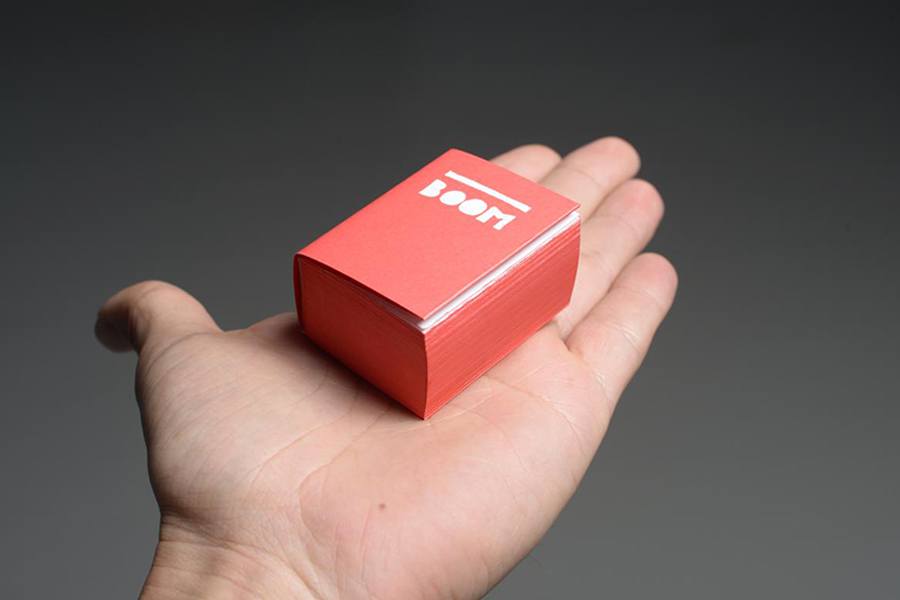
5. Irma Boom
The ‘Queen of Books’ – the ultimate label to be given hey. Irma Boom has been designing books since the 1980s with an artistic expression and bold approach using die-cut holes and experimenting with paper folding and formats. One of her most well known projects: The Architecture of the Book featured two contrasting format sizes miniature and XXL. Design projects like this challenge the form of a book to be regarded as ‘objects of desire’. Her contribution to book arts and design led to being the youngest designer to receive the Gutenberg Prize. As with all the designers on this list, Irma’s works are exhibited in the permanent collect by MoMA in New York.